Provision Map allows you to see a visual representation of your school’s provision and plan outcomes over a time period of your choice through outcome trends reports.
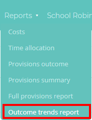
To view an outcome trends report, mouse over the Reports tab at the top of the page and select Outcome trends report from the list of available options.
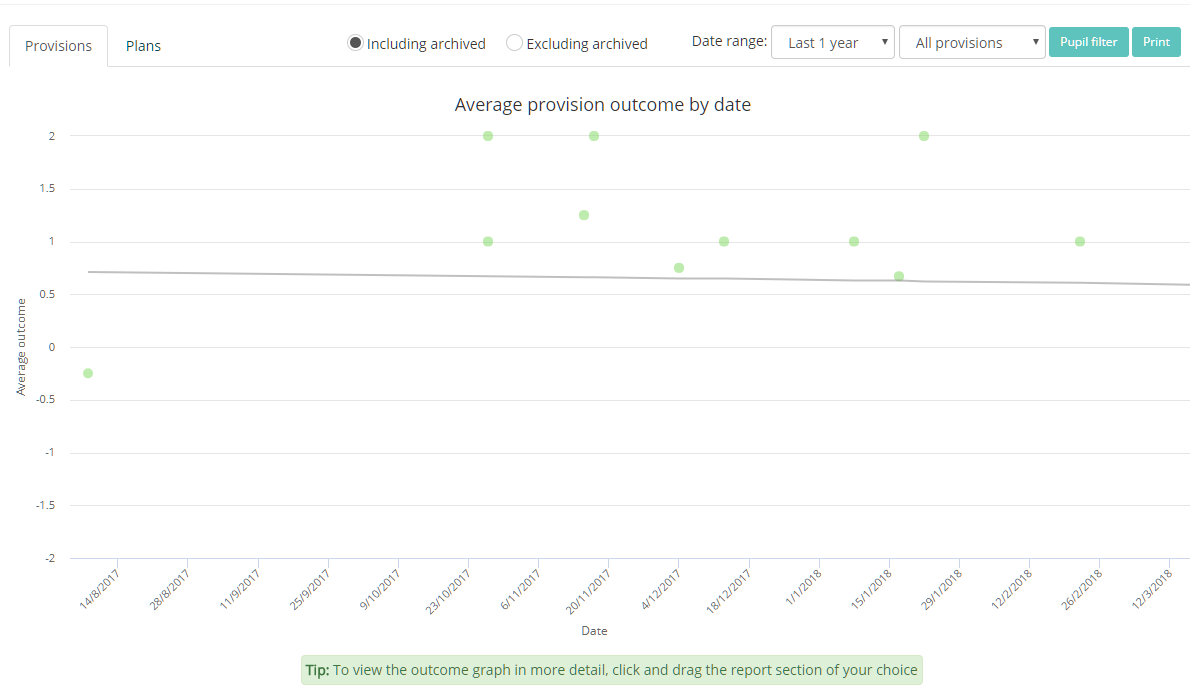
You will be presented with a graph similar to the one below. The dots represent each provision / pupil, with their outcome on the y-axis and the date that the outcome was recorded on the x-axis.
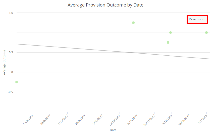
To focus on a section of the graph in more detail, click and drag your mouse over the graph.

Letting go of the mouse will display your graph selection in more detail. To return to the full graph, click on the Reset zoom button.
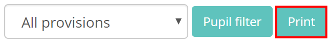
To print the current view of the graph, click on the Print button in the top right hand corner of the page.
Filtering options
To include or exclude archived provision and plan outcomes on the graph, click on the Including archived and Excluding archived radio buttons respectively.

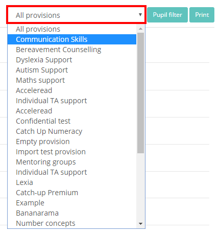
To filter the graph to a specific provision, click on the All provisions drop down menu and select a provision.
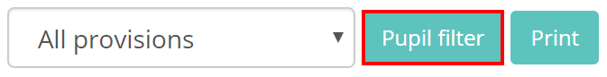
To filter the graph to specific pupils, click on the Pupil filter button in the top right hand corner of the page.
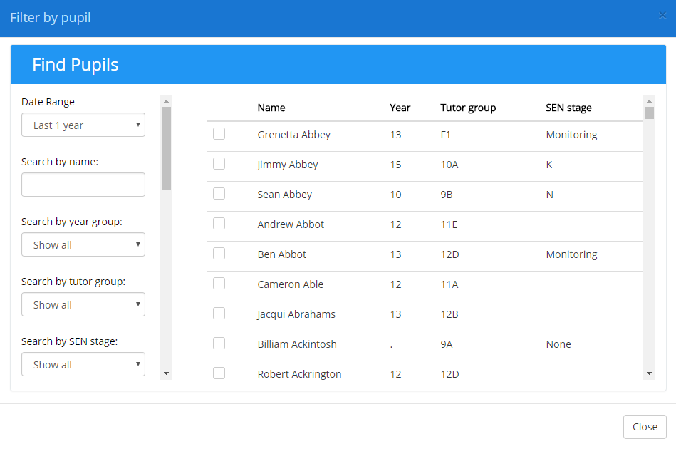
The Filter by pupil popup will appear. Select your chosen pupils by ticking the checkbox next to their names and click on the Close button to apply the filter.
Viewing plan outcomes
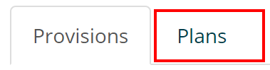
To switch to viewing plan outcomes over time, click on the Plans tab above the graph.
Moving your mouse over a dot on the graph will reveal the pupil’s name, the plan’s outcome and the date that it was reviewed.
